Over the next few days I am going to be posting some photos of the 10 cards *yes-SHOCK* I have published in the new TAC 2011 Inspiration book. I was so honored to have had the opportunity to have a sneak peek of the awesome images to debut in the catalog and so excited to work with them. I've already placed my first order and WOW...not much left after my first shopping spree!!!
Be...
A very simple layout...The detail is in the image, the distressing and the coloring. A bit of stickles was added to the centers of the flowers and the wings on that bee...
I just love distressing blue Bazzill paper with white ink. It makes it appear a bit like denim...PERFECT for thise flowers. The background was such fun to color with my copics too. Because of the relaxed feel I got from the image, I was able to relax a bit with my coloring to just focus on light/shadow and depth. I really
liked the trellis design (also available in stamp set form) in the background.
A closer look at the blue paper and the coloring. Click to see it in closer detail. Stitching over the ribbon made the ribbon feel purposfully placed, not an afterthought. Tracing a black line around the Be. sentiment tied it in with the focal image.
Version 2: WHO YOU ARE...
For this card, I pulled from the same palate and the same supplies but added a little graphing paper to the layout. Additional doodling was added around the sentiments and the white base.
I can't seem to do without a little sparkle...SO...Crystal Stickles was added to the center of the flower. This is such a great flower image to color. Just a few Copic colors scattered throughout the image and it came to life!
I love this sentiment!! A closer look at the torn edge and the script background stamped on the blue cardstock.
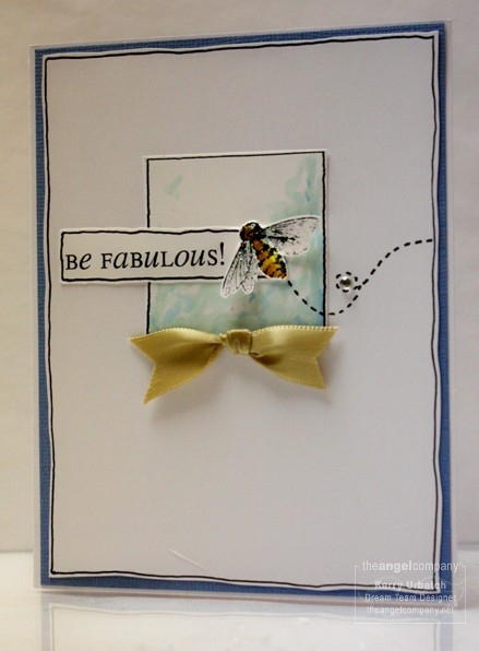
Version 3: BE FABULOUS!...
Again, Used the same color palate and doodling theme. Simple and sophisticated...with a bit of sparkle on the bee's wings and a bit of bling to finish it off.
Evidentally, this card was considered for the cover. I'm quite shocked but not surprised it didn't make the cover...Too white...and too simple!
A PDF of these cards that includes the supplies used is available. Please email me or post a comment with a way to reach you if you would like a copy free of charge.
I'll return tomorrow with more peeks at my published cards.
Kerry