
Be...

A very simple layout...The detail is in the image, the distressing and the coloring. A bit of stickles was added to the centers of the flowers and the wings on that bee...

I just love distressing blue Bazzill paper with white ink. It makes it appear a bit like denim...PERFECT for thise flowers. The background was such fun to color with my copics too. Because of the relaxed feel I got from the image, I was able to relax a bit with my coloring to just focus on light/shadow and depth. I really
liked the trellis design (also available in stamp set form) in the background.
A closer look at the blue paper and the coloring. Click to see it in closer detail. Stitching over the ribbon made the ribbon feel purposfully placed, not an afterthought. Tracing a black line around the Be. sentiment tied it in with the focal image.

Version 2: WHO YOU ARE...
For this card, I pulled from the same palate and the same supplies but added a little graphing paper to the layout. Additional doodling was added around the sentiments and the white base.


I love this sentiment!! A closer look at the torn edge and the script background stamped on the blue cardstock.

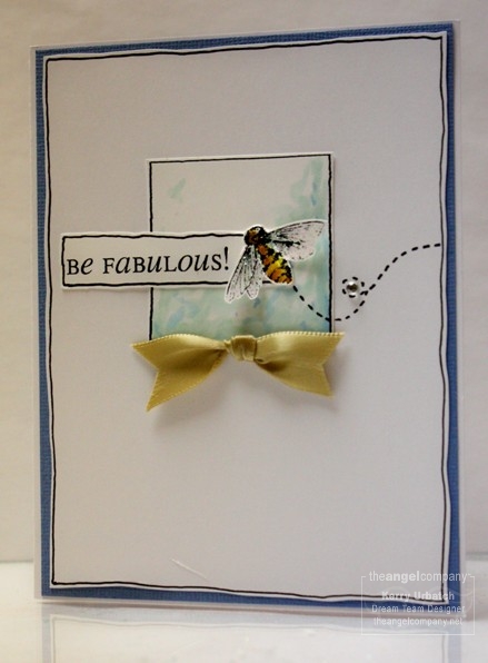
Version 3: BE FABULOUS!...


A PDF of these cards that includes the supplies used is available. Please email me or post a comment with a way to reach you if you would like a copy free of charge.
I'll return tomorrow with more peeks at my published cards.
Kerry
Those are awesome! A big congrats to you!!
ReplyDeleteI love these. You are fabulous!!!
ReplyDeleteThese are some of my favorite cards in the catalog!! I have to have this set because of these cards!! :)
ReplyDelete